Optimizing You.com
Lesezeit: 5 min
You.com needs to level up their UX game at hyperspeed or they'll miss the wave
Great start, but the UX needs an instant makeover to not miss the current momentum and to actually really catch the wave.
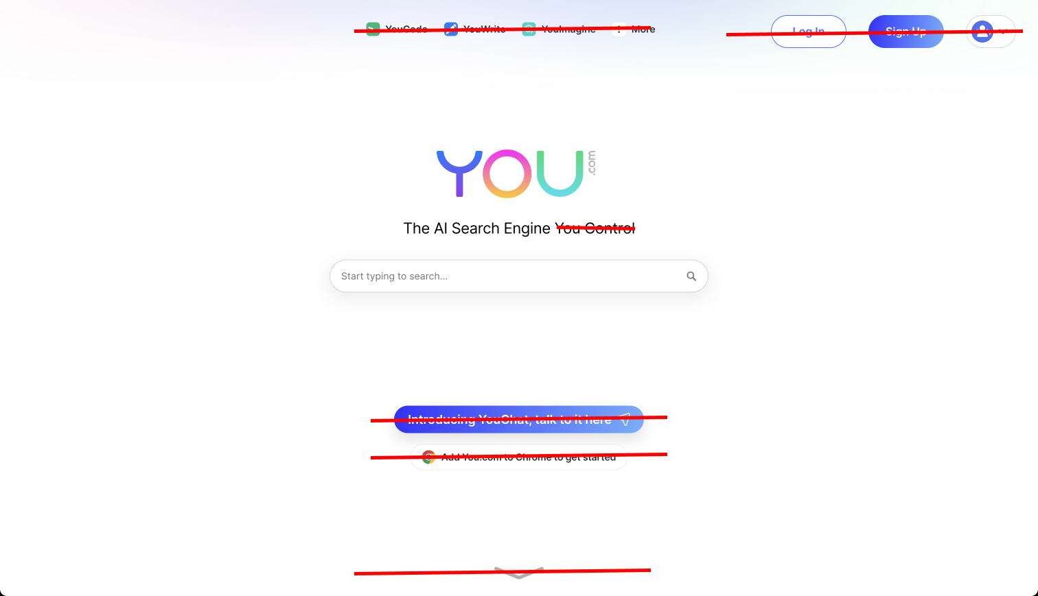
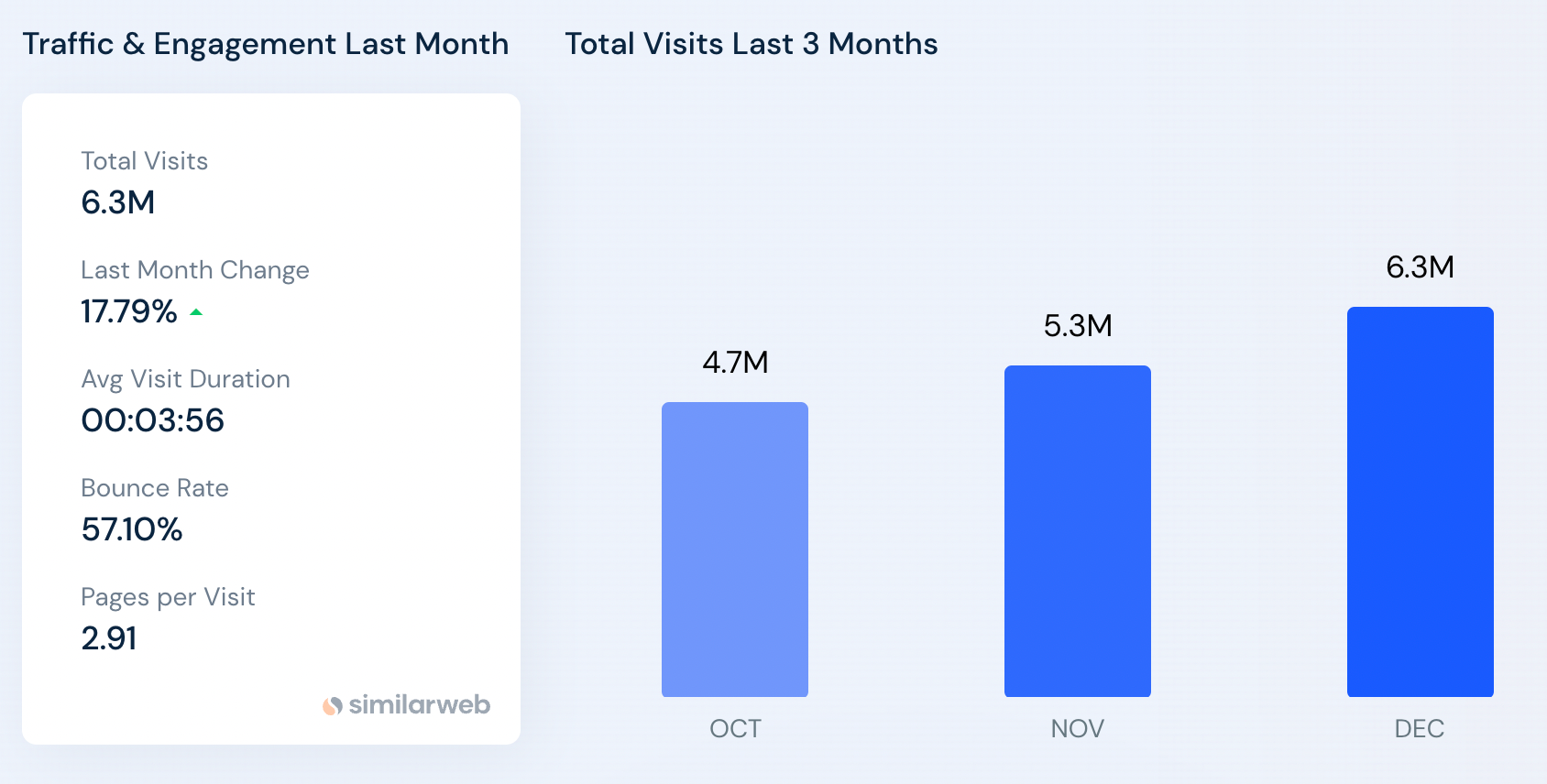
6 Million visits (Similarweb) is already great, but we need to make it super strong at first contact to keep users coming back – and right now it looks like a feature-creep-overload-bomb on start and result page.
My suggestion: start AB-testing right now, otherwise you'll get stuck in a suboptimal design and user experience.
You.com - Traffic & Growth
Similarweb
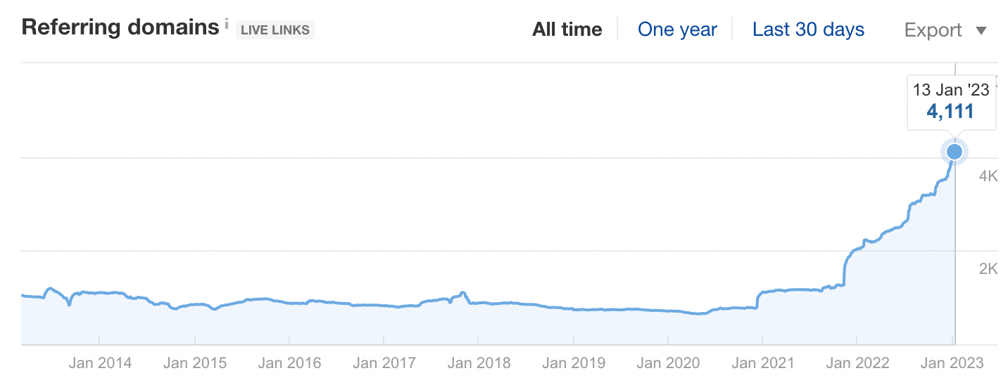
Good: Referring Domains are growing
Quick fixes
What would i improve on you.com?
Start page improvement batch 1
What would i improve?
- LESS buttons -- remove every unnecessary button immediately
- less "toy"-colors
- focus on search and chat, hide the rest in some minimalistic nav menu
That's all - currently it's a feature creep overload.
I see the potential and the momentum of the moment. I love to see a new player in the game, but this needs to get better immediately, otherwise this won't take off as fast as it could. Happy to meet for a free opti-call.
Or just use this speed-version:
Startpage
- Don't sell me anything, this is my first visit, i want to feel the magic!
- Top menu buttons with on-hover-menu are awful, remove
- Remove login-button
- Remove signup-button
- Don't link to the chat, just load it in the results
- Don't push me to the chrome plugin, convince me first! Remove the chrome plugin-button.
- No below the fold creep. Why is there an arrow trying to make me scroll? You don't want me to scroll, you want me to use the engine.
Quick fix: simply hide EVERY button in ONE tiny menu that doesn't show on hover.
Result would be: a clean page.
Don't sell feature wonderland on page 1.
First user contact counts.
What you need to do?
Deliver magic on first impression.
Magic first, feature-creep later :)
Start page improvement batch 2
Before:
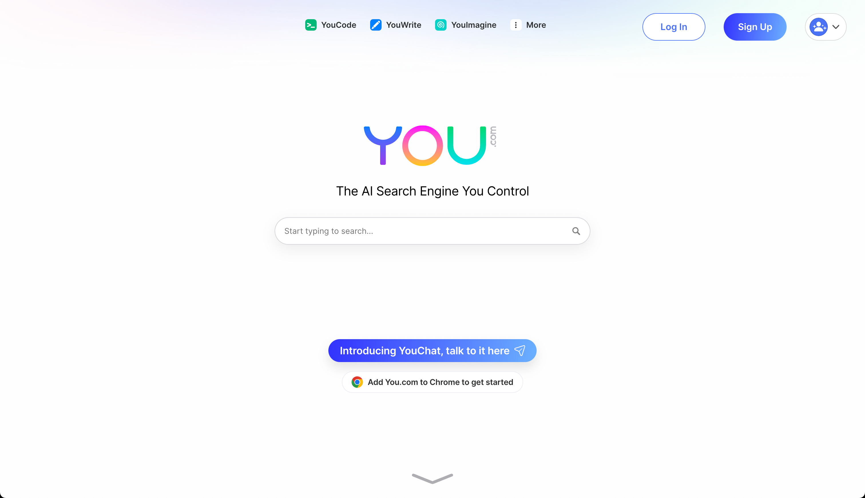
Kick all this stuff:

After:
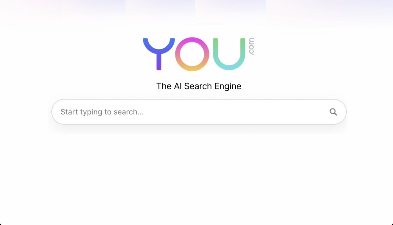
This was a quick Figma-hack, but you get the idea: first remove everything. Then only add what's really necessary.
The wording needs finetuning as well.
The AI Search Engine you control. -> removed the "you control" -> that's redundant and boring.
"Start typing to search" inside the search bar. That's unnecessary.
People already know how to search, really, they do.
Let's have a look at Google:
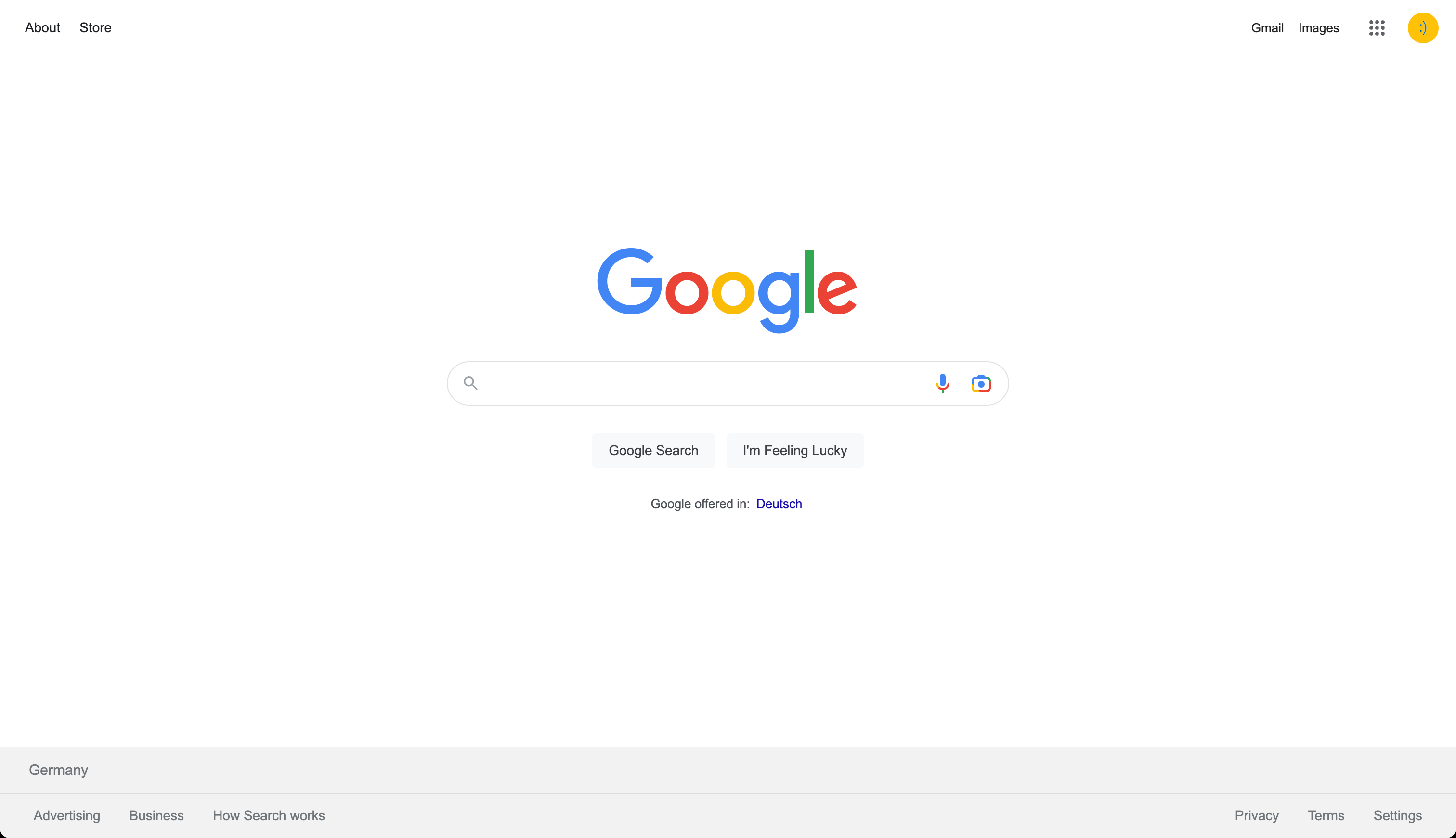
You can clearly see how almost every UI element has been moved to the corners, farthest away from the center of attention: the search bar.
How this all started: a friend recommended looking at you.com, i was euphoric to test it, but my first experience was awful.

Yes, i was wrong.
But i love the idea, and i love to see a fresh player in the game.
I somehow don't believe that Google or Microsoft Bing will deliver decent innovation that will disrupt themselves.
I saw, i clicked it, i cried, i tried to forget it.
But i couldn't.
And a friend reactivated my curiosity and hope when he sent me this interview with the founder Richard Socher on ZDNET.
I had this Linkedin-Post on the end of Google and jammed in the comments with some great minds, when i was hit by "the flash" of inspiration, once again.
Whenever my mind gets hit by "the flash", i have to express it immediately, so i spread out my ideas of helping You.com and my thoughts about how to help across multiple Linkedin comments in different places - which felt wasteful.
So i returned to the blog-pad and take note in the name of the future!
To the rescue, here i am – remixing my Li-comments and thoughts into this post.
Cheers to your brains!
Initiating ping :)

Shall we ping the founder and make some suggestions?
That's how it started – the rest is history.
A few comments, a few messages - and here we are - ready to change world!
Links
Here are some links to my few posts and comments, and to other related resources.
